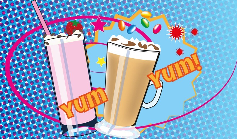
Giving Kool Kup its own unique identity!
Having worked with the UK Kool Kup Distributor for some time we were very aware of the story of Kool Kup, how it came about, and its unique properties compared to other products on the market. It was realised from the outset that there would be a need for a significant number of images, and as there was going to be a recipe section on the website, this requirement would be on going. With the advances in technology, images now need to be of the highest quality to display well on both desktop and mobile devices, and it became clear during the initial photography that this would be potentially quite costly both in terms of finances and time.
Although already well into the website build, we felt that there had to be a rethink, and after playing around with different ideas we came to the conclusion that “yes” there was a need for some high quality images, but that Kool Kup needed to have its own identity, so we proposed pop art images to tell the story as well as using them to give the brand a visual differentiator that was both striking and colourful.
Our designer Lucy produced the pop art images for both the website and offline marketing materials. Where there was a need for high quality images, we sourced them from online image libraries.
The website was build using a template on the WordPress platform that allows the client to easily make changes and add new content such as recipes. It was delivered with plugins for automated backups, hack protection and was populated with a basic search engine optimisation (SEO) foundation.


